OmniFocus 3 pane design
Background
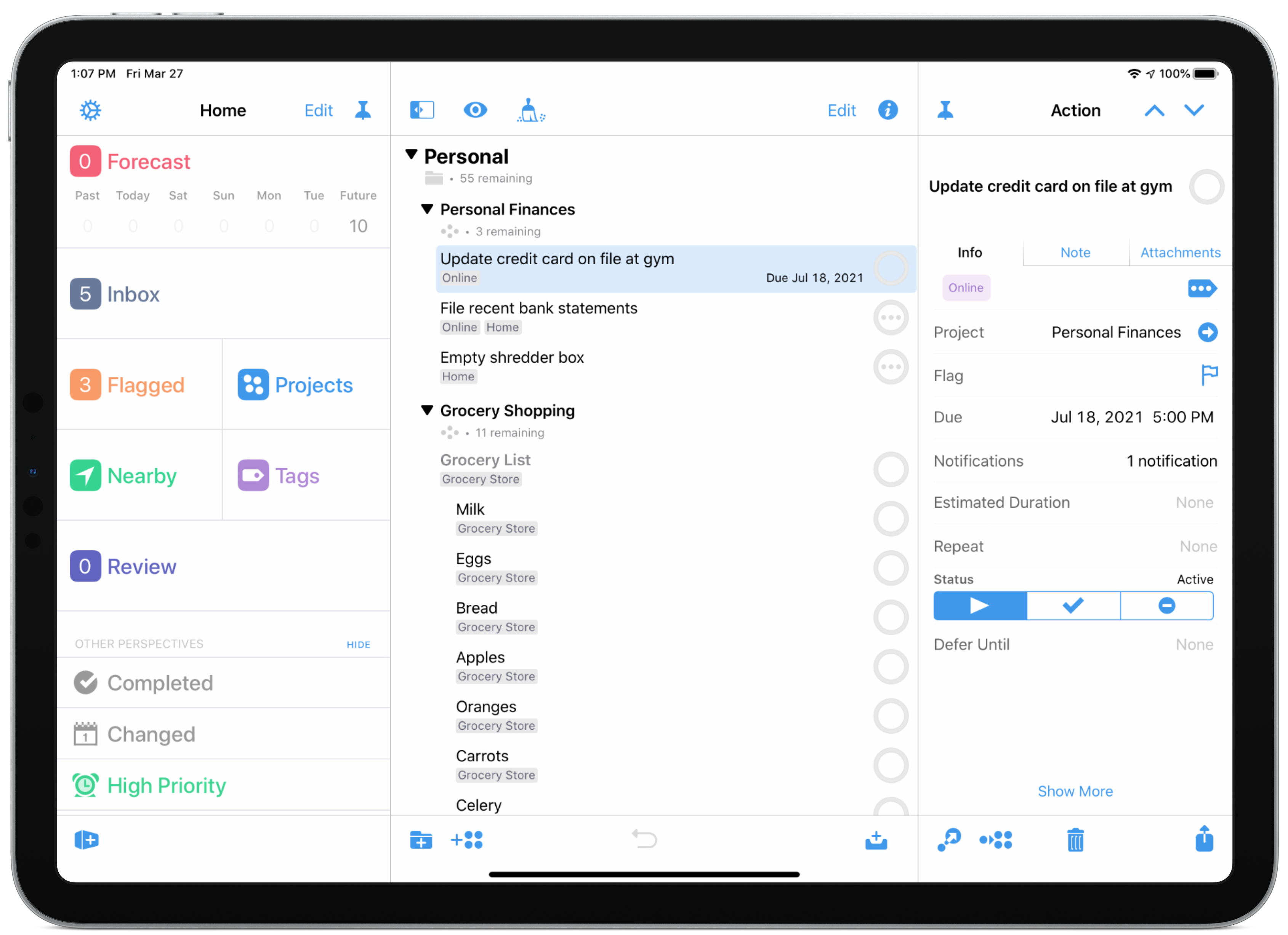
The most requested feature for OmniFocus 3 for iPad was a user experience that resembled the Mac application. Users wanted the familiarity and productivity boost of the Mac interface, describing it as “intuitive” and “essential for power users.”
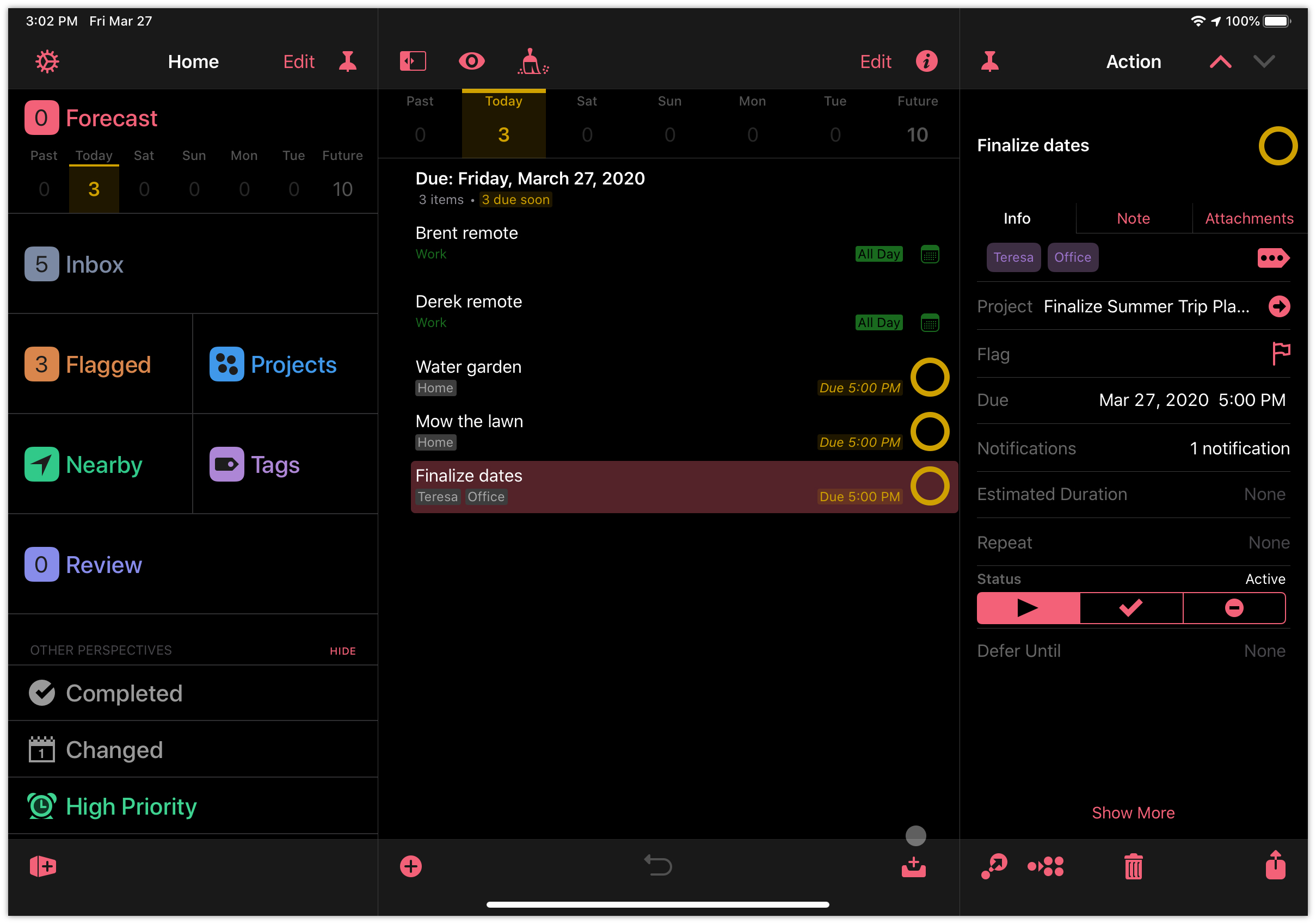
The core problem was that the existing iPad interface did not provide the same level of efficiency or intuitive control as the Mac version. Users were frustrated with performing extra steps to access key features, affecting their productivity. The goal was to bridge this gap and provide a consistent experience across platforms that would enhance both familiarity and ease of use.
User Research Details
To address this problem, I led the research process by gathering user insights and identifying key requirements. The research involved user interviews, surveys, and usability testing with a sample of 50 users, including both new and experienced power users. Key findings highlighted the need for a more efficient navigation structure and the importance of reducing the number of taps required to access frequently used features. Users found the existing iPad interface cumbersome compared to the Mac version.
For example, one user noted:
“I love the Mac version because everything is just a click away, but on the iPad, it feels like I’m constantly tapping through menus and windows.”
This kind of feedback helped shape the design requirements and directly informed the specific goals that were set for the project. We used these insights to define our objectives, ensuring that our solution would provide a more efficient navigation structure and reduce the number of taps required to access key features.
Persona Development
To understand user needs more thoroughly, we created user personas and journey maps, highlighting workflows and common pain points. The personas were developed based on insights gathered during user interviews and surveys, focusing on users’ specific needs, behaviors, and goals. By creating personas to represent different user segments, such as new users and power users, we were able to tailor our design solutions effectively.
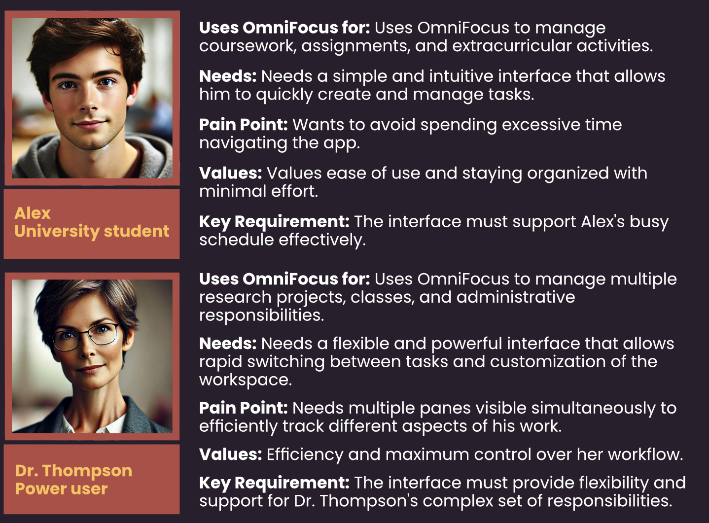
These personas helped us identify with key user segments: power users who required quick access to multiple views, and new users who benefited from familiar, intuitive navigation. By focusing on these personas, we ensured that our design decisions directly addressed the unique needs of each user type.
Goals
Our goal was to develop a flexible framework that allowed users to view three different areas of OmniFocus simultaneously: the perspective view (which provides a high-level overview of tasks and projects), the project view (which shows detailed information about specific projects), and the inspector panel (which allows users to view and edit additional details for selected items). This enhancement aimed to provide more context for database content while minimizing the number of taps required to access frequently used UI elements.
Approach
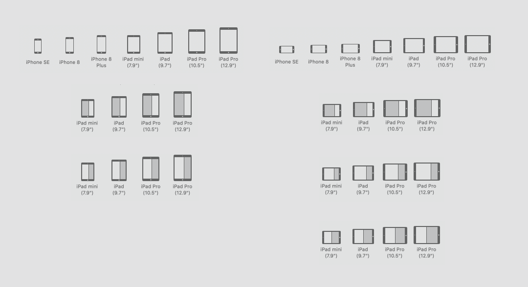
The key challenge was creating a three-pane solution that functioned seamlessly across different iOS size classes (such as compact, regular, and full-screen) while also accommodating the iPad multitasking framework, which included supporting Split View and Slide Over modes. The three-pane layout needed to adapt to various iPad screen sizes and behaviors, such as device rotation and multitasking mode.
Challenges and Resolutions
To provide a quick reference, here is a summary of the key challenges we faced and how we resolved them during the design process:
| Challenge | Resolution |
|---|---|
| Ensuring the three panes adapted to different screen sizes without overwhelming the UI. | Developed a flexible grid system and dynamic resizing rules based on usability testing feedback. |
| Making the layout compatible with Split View and Slide Over modes. | Implemented a cascading dismissal approach, refining transitions to improve user experience. |
| Allowing users to keep specific panes visible while navigating. | Introduced a “pinning” feature with added visual indicators to clarify interactions. |
Iterative Prototyping and Key Challenges
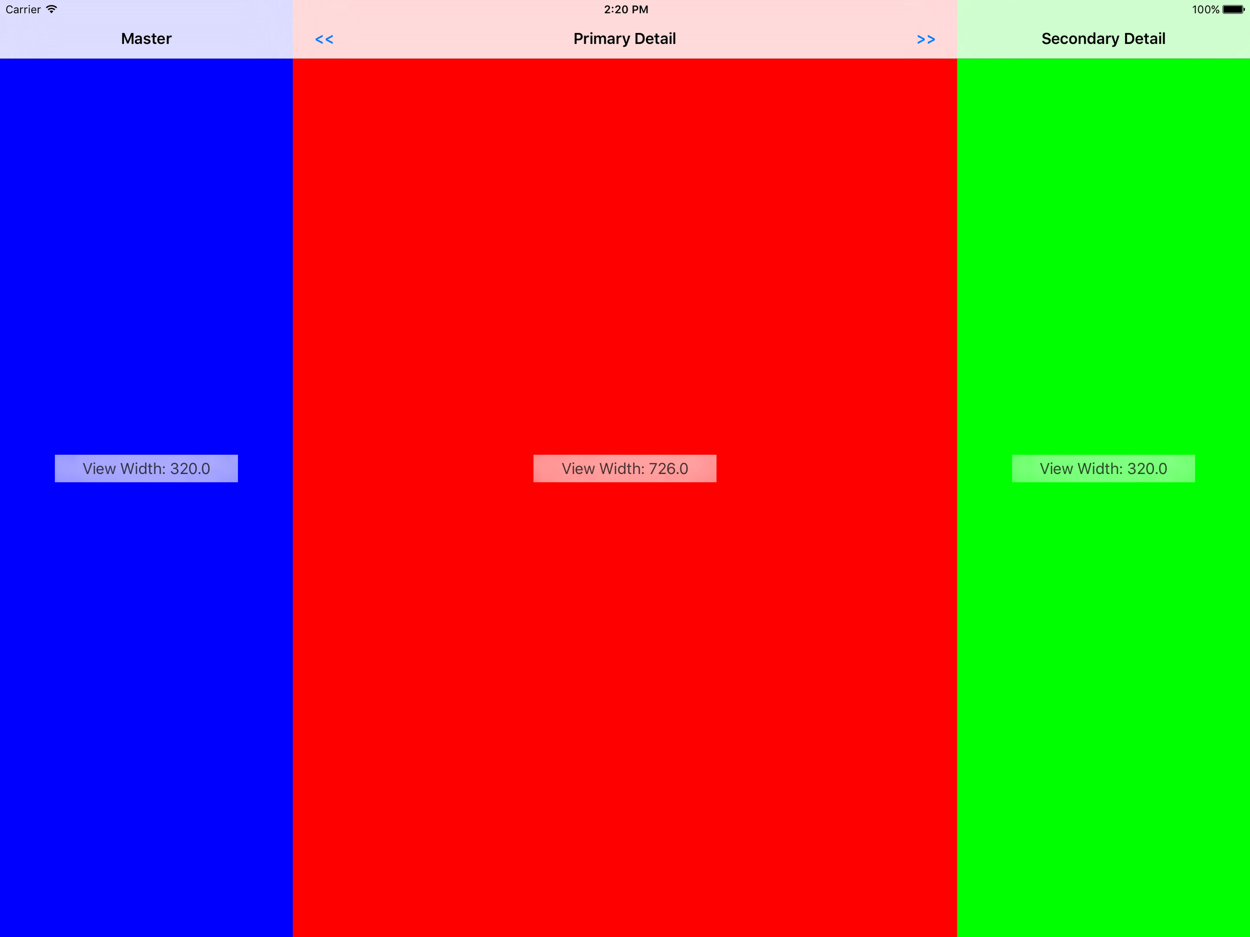
During the prototyping phase, we conducted multiple iterations to address the specific challenges that arose:
Iteration 1: Initial Layout Design
- Challenge: Ensuring the three panes could adapt to different screen sizes without overwhelming the user interface.
- Solution: We started with a flexible grid system and conducted usability testing to determine the optimal sizing for each pane. Feedback indicated that the original layout was too cluttered on smaller screens, which led us to create more dynamic resizing rules.
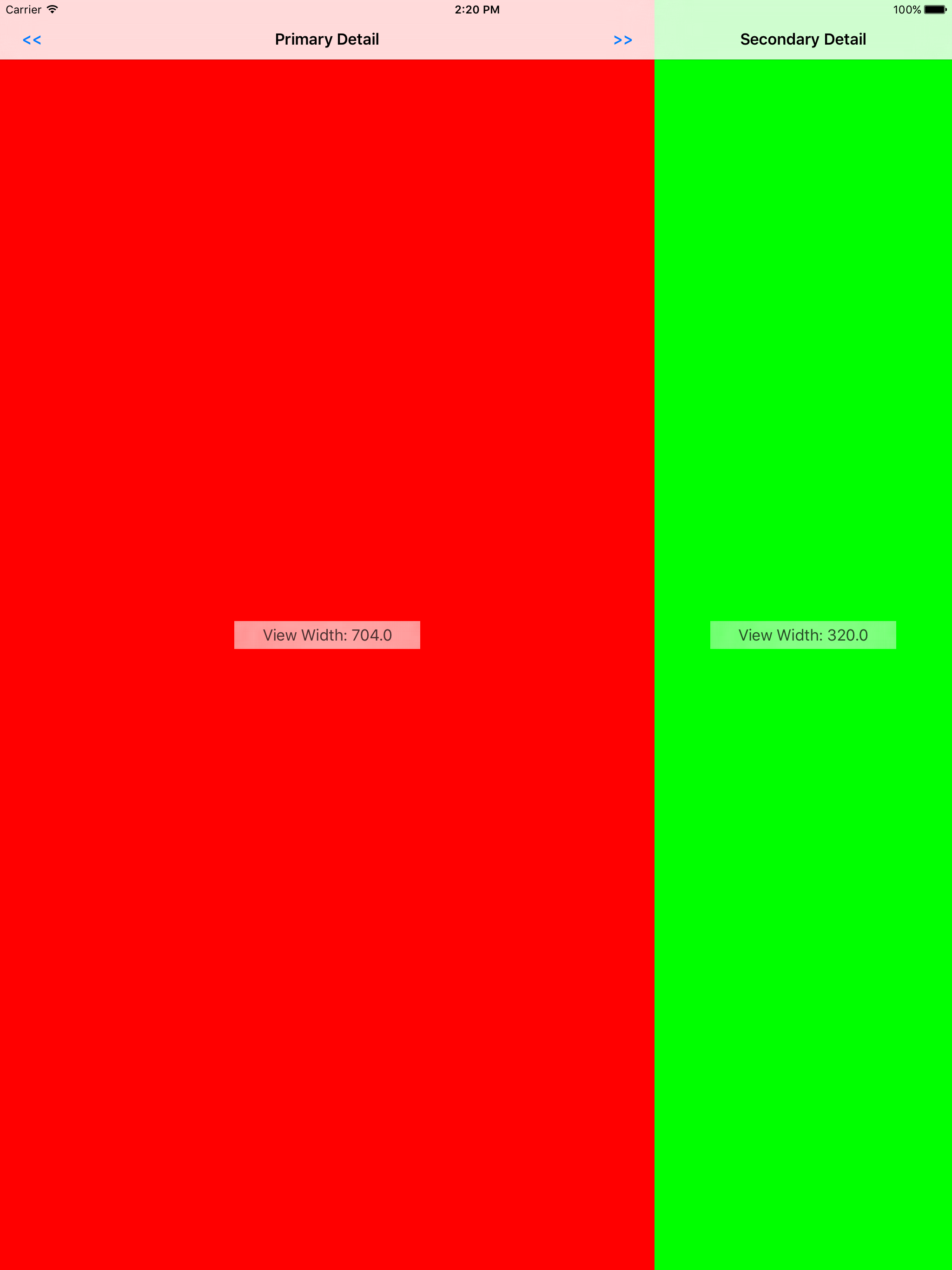
Iteration 2: Split View and Slide Over
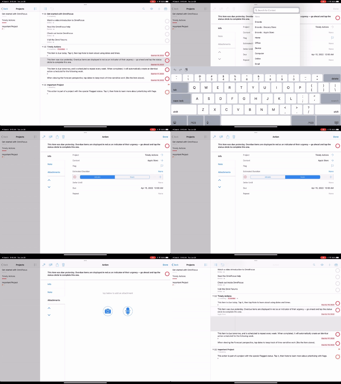
- Challenge: Making the three-pane layout compatible with Split View and Slide Over multitasking modes.
- Solution: We implemented a cascading dismissal approach, where the right-side inspector was dismissed first as the screen size narrowed. User testing revealed that this approach worked well for multitasking but needed smoother transitions, which we refined in subsequent iterations.
Iteration 3: Pinning Feature
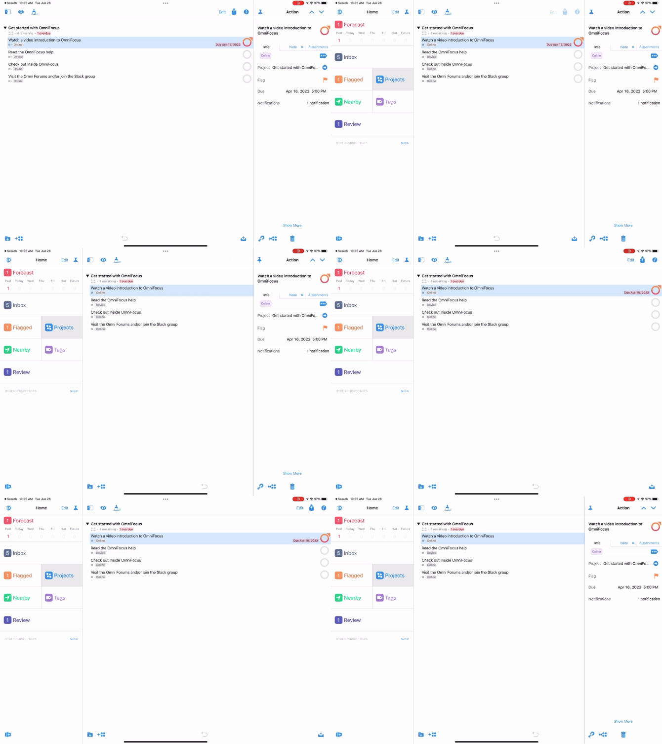
- Challenge: Allowing users to keep specific panes visible while navigating other parts of the app.
- Solution: We introduced a “pinning” feature, allowing users to lock a pane in place. During testing, users appreciated the flexibility, but some found the interaction unclear. Based on their feedback, we added visual indicators to show when a pane was pinned.
Developer Collaboration and Feedback
The implementation of this UX required extensive collaboration with developers to ensure that the designs were feasible and adaptable to technical constraints:
- Memory Management: Handling multiple panes simultaneously led to memory usage issues. Developers provided feedback on optimizing data loading and unloading, which resulted in improved performance. We adjusted the design to only load data in active panes, significantly reducing memory consumption.
- Smooth Transitions: Developers also worked on refining the animations for pane transitions, ensuring a seamless user experience. Their feedback was crucial in adjusting the timing and responsiveness of the animations, which improved the overall fluidity of the interface. These iterations and close collaboration with the development team ensured that the final product met both user needs and technical requirements, resulting in a robust and user-friendly solution.
Outcomes
Metrics Visualization
To better illustrate the success of the project, we visualized key metrics through charts and graphs: User Satisfaction Increase: A 16% increase in user satisfaction was observed after implementing the new design. This improvement is depicted in the line chart below, showing user satisfaction scores before and after the update. Engagement Metrics: Engagement rose by 22%, with a higher number of active users. The bar graph below displays the growth in active usage compared to the previous version, OmniFocus 2. Sales Growth: Sales grew by 28%, with active user numbers rising by 35%, surpassing the figures for OmniFocus 2. This trend is shown in the pie chart, illustrating the percentage growth in sales and user numbers. Including these visual elements made the results more impactful and easier to understand at a glance.
The three-pane solution was successfully implemented in OmniFocus 3, receiving highly positive feedback from users. Comments like:
“This update makes managing my projects so much easier”
and
”The new layout feels incredibly intuitive”
demonstrated user satisfaction. User satisfaction scores increased by 16%, while engagement metrics showed a 22% rise in active usage compared to OmniFocus 2. The update improved app efficiency, making it a more versatile tool on the iPad.
Additionally, the seamless update process for new iOS releases ensured a consistent and reliable user experience. Sales grew by 28%, and active user numbers rose by 35%, surpassing OmniFocus 2. This success underscored the importance of user-centered design, collaboration, and iterative prototyping in delivering a bespoke UX solution.